Logo & Branding
Acorn Equity
New Logo and Branding

We were asked to create a new logo for a property let company based in Nottingham.
This will then be carried out into To Let boards and a website.
The Acorn replaces the "O" and we used 4 squares as the window. To top it off the oak leaf is subtly used as smoke out of the chimney.
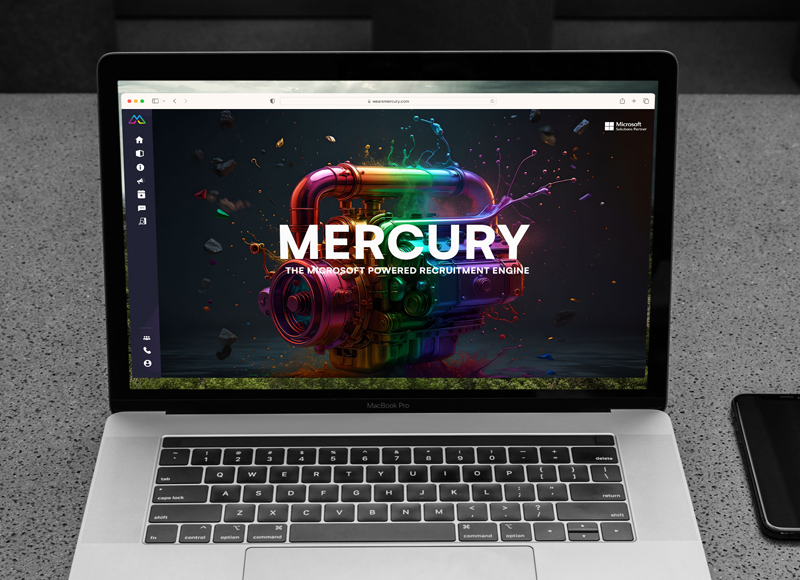
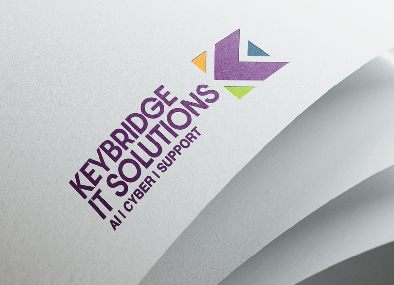
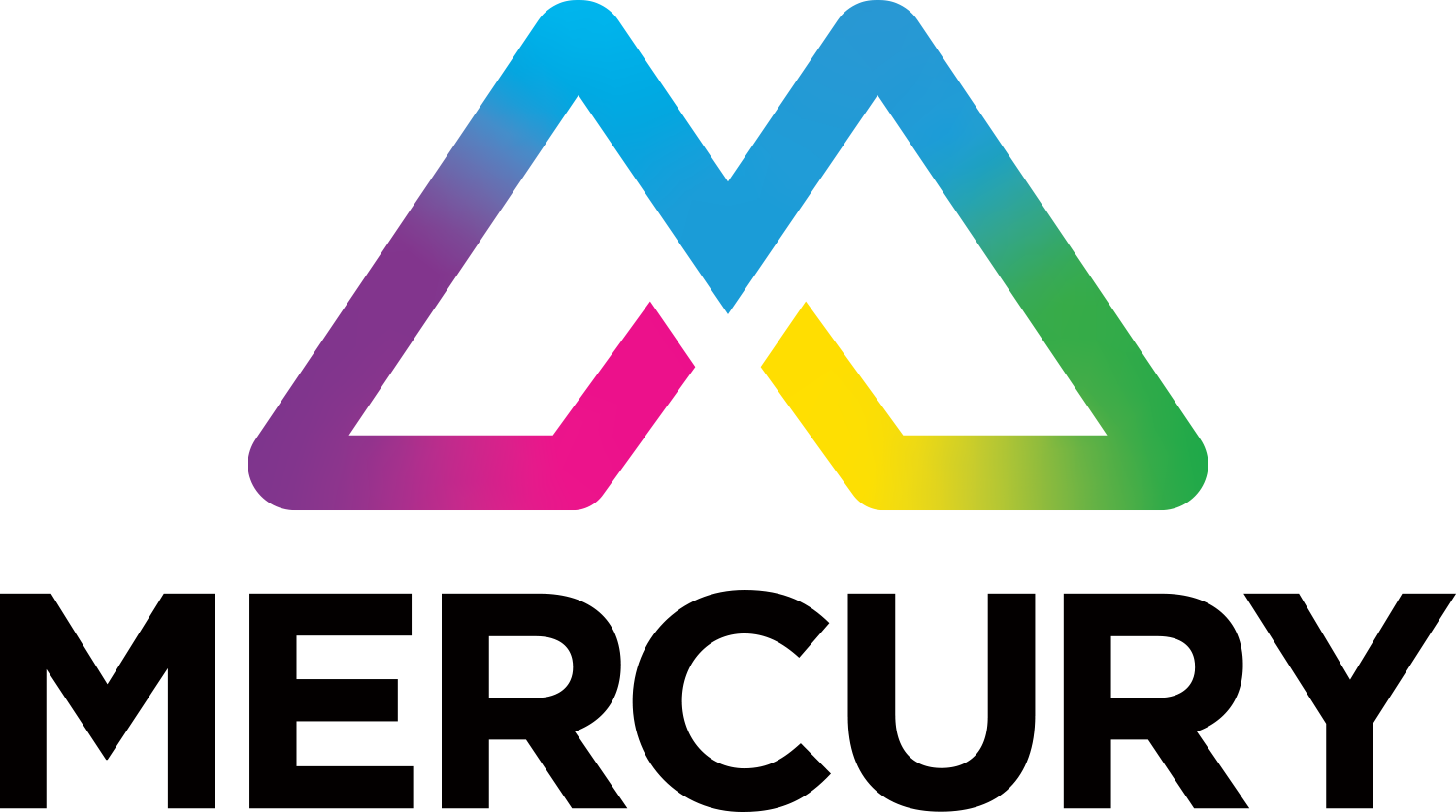
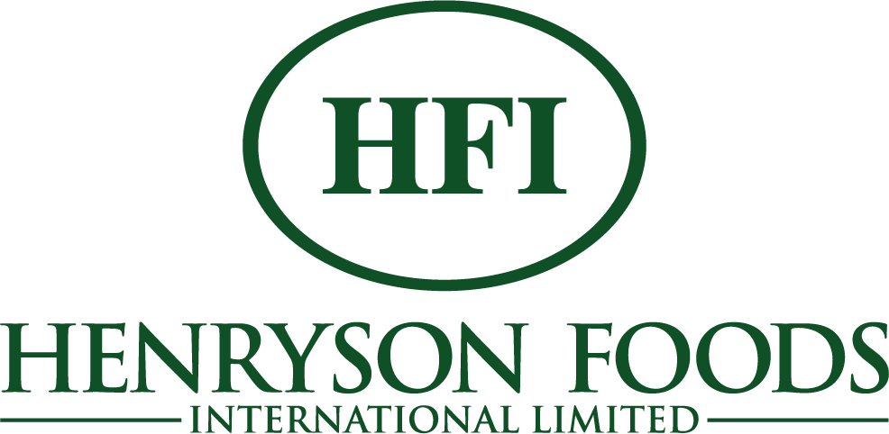
portfolio
More portfolio examples
We help brands stand out through multiple channels. Take a look for yourselves.


Let’s Get in Touch
Thank you! Your submission has been received!
Oops! Something went wrong while submitting the form

Omega3design are a logo design, graphic design and website design agency. We specialise in offering great value graphic design services to small to large businesses in the UK. Our team work closely with our clients to ensure that they are always 100% happy with the end result.
